Design Systems
A Design System for 2M Banking Users
Reduced user confusion from 30% to 8% through systematic design
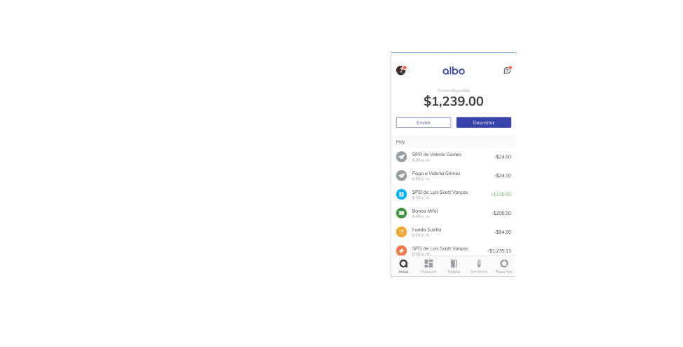
Albo·Digital Banking·2M+ users
The Problem
- 30% of users said the app was confusing.
- Same button, different places. Same action, different names.
- Each team designed in silos. No shared language.
- Design was a bottleneck—and investors were watching.
What I Did
Product Design Lead · Design Systems
- Established design values and principles for everyday decisions
- Built normalized workflow for designers, PMs, and developers
- Created documentation and governance model
- Built trust across teams with different metrics and priorities
Key Wins
- Reduced user confusion from 30% to 8% (73% improvement)
- Unified terminology, assets, and component library
- Enabled faster iterations without design bottlenecks
Quick summary complete
Want the full story?Keep reading
📖 Full Case Study
🎯 The Challenge
Keeping diverse teams aligned was the biggest challenge. Connecting different units' concerns and turning them into opportunities required careful navigation. Building trust across teams with different metrics required strategic conversations and active listening.
✅ The Solution
Built a design system that unified terminology, assets, and components while creating a normalized workflow for designers, PMs, developers, and stakeholders. Established values and principles that became the foundation for everyday design decisions.
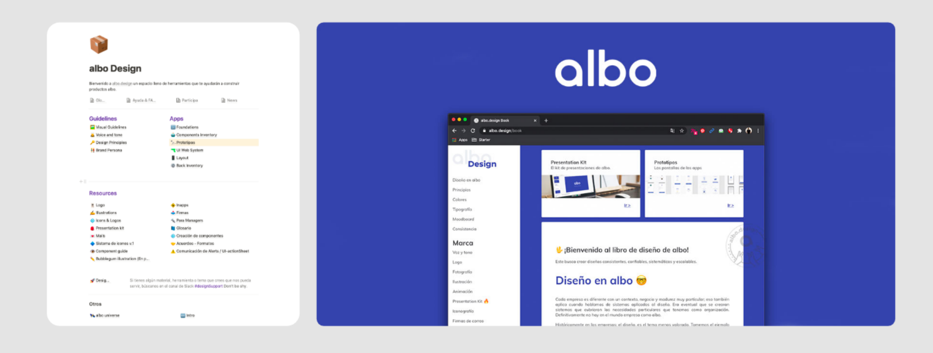
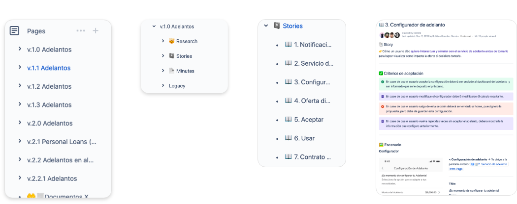
v.1 and v.2 of the albo design documentation
Values and Principles
Simplicity First
The core was based on computational design and atomic paradigm—concepts too complex for most stakeholders. I simplified it to 15 variables that build the entire app ecosystem. Easy to track, understand, and share.
Principle-Driven Design
Four principles guided us: Honest, Simple, Empowering, Personal. The system creates more than UI elements—it provides a shared language for collaboration across teams.
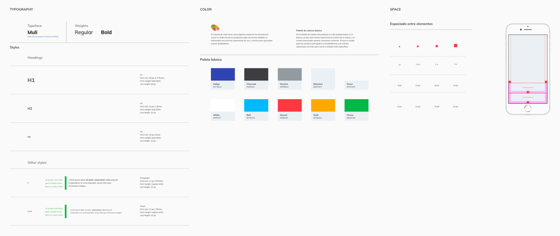
Design system foundations
Component Libraries
Federated Ownership
We created a single source of truth accessible to everyone, using a federated model for component maintenance across teams.
Documentation Standards
Component documentation accelerated developer work and unified libraries, improving development efficiency across all products.
Consistent Formats
Standardized documentation formats allowed any designer to continue another's work. Aligned product, component, and feature docs made us faster with each iteration.
UI Kit v1 and v2
Component Inventory
Cross-Team Impact
The component inventory helped designers and developers alike. Reusable code blocks reduced estimated project time across the organization.
Shared Language
The goal was transforming the inventory into a common language between developers, designers, and stakeholders—everyone knows what "the primary button" means.
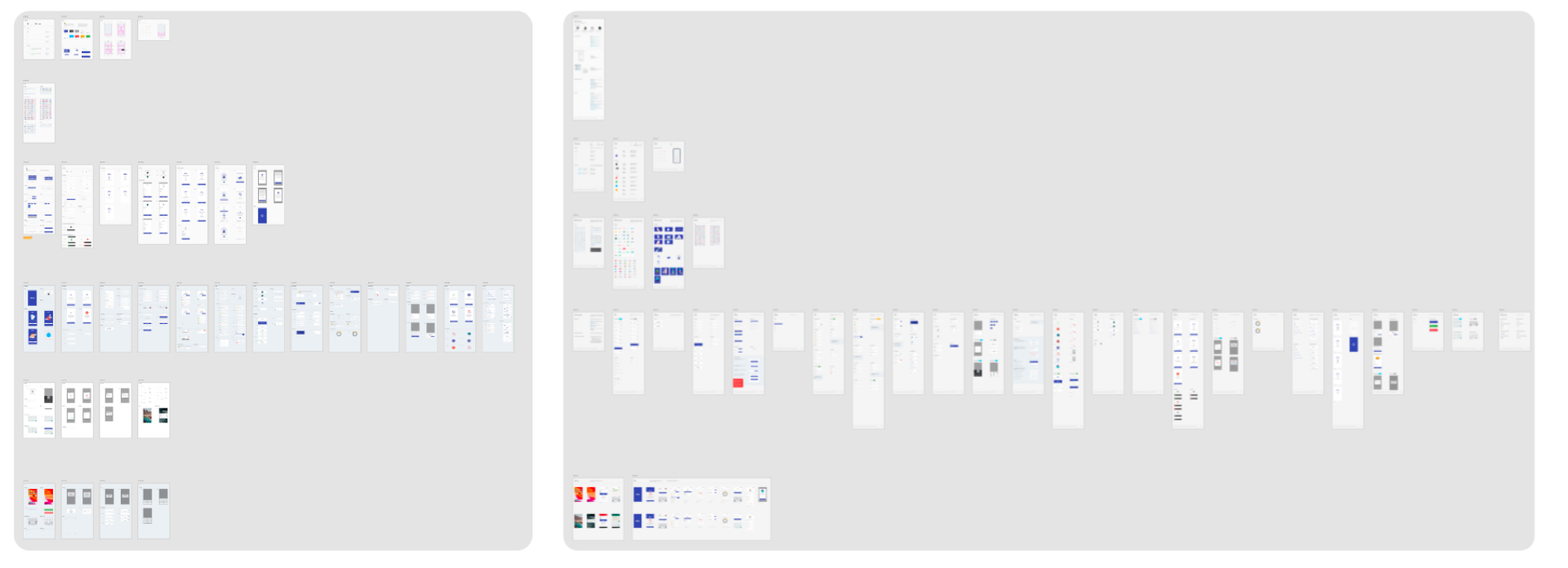
Component audit and optimization
UI Kit Evolution
More With Less
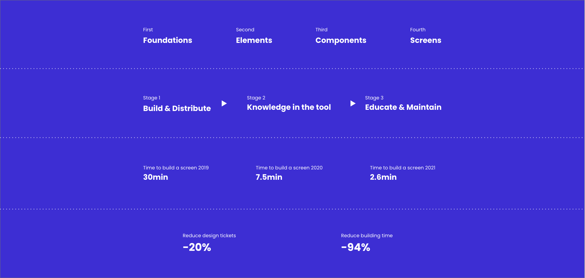
Version 1 documented what we had. Version 2 simplified it. By finding patterns, we reduced from 100 to 35 components while building the same banking application—easier for designers, developers, and users.
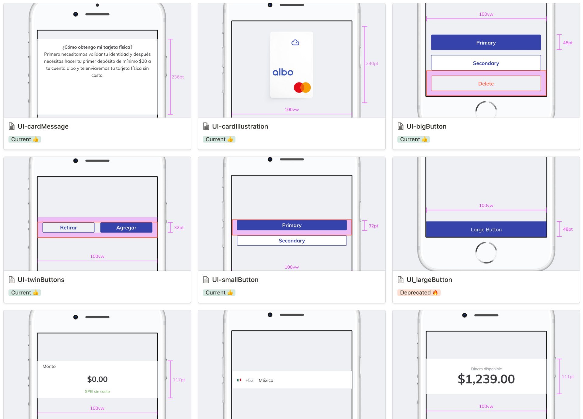
From 100 to 35 components
Documentation
Bridging Design and Product
PMs flagged that design-product communication was unclear. We created a unified documentation structure for every product unit, improving handoff quality.
Unified documentation structure
Impact
Measurable Quality
The system enabled designers, developers, and PMs to measure prototype quality and QA deliveries against business goals.
Design Culture
The design system became a shared space for growth—designers learned, experimented, and reviewed work with clear rules and consistent standards.
Measurable outcomes
Project Learnings
Stakeholder Empathy
Building a system requires answering hard questions: What is it? How long will it take? Do we need more people? I learned to address stakeholder priorities while driving meaningful change.
Courage to Lead
I often questioned whether I had permission to push new frameworks or technologies. Looking back, taking those risks helped teams across the organization. When you're transparent and listen, sometimes you need to ask: is this really the best we can do?
Team Architecture
DesignOps Process Flow
flowchart LR
subgraph Input["📥 Input"]
R["Research\nUser Needs"]
B["Business\nRequirements"]
end
subgraph Process["⚙️ DesignOps"]
Doc["Documentation\nStandards"]
Inv["Component\nInventory"]
QA["Quality\nMeasurement"]
end
subgraph Output["📤 Output"]
DS["Design System\n35 Components"]
Lang["Shared\nLanguage"]
Speed["Faster\nDelivery"]
end
subgraph Teams["👥 Teams"]
Des["Designers"]
Dev["Developers"]
PM["Product"]
end
R --> Doc
B --> Doc
Doc --> Inv
Inv --> QA
QA --> DS
DS --> Lang
Lang --> Speed
DS --> Des
DS --> Dev
Lang --> PM
Interested in working together?
Open to Product Design Lead, Product Design Engineer or Design Manager roles at product companies building products and infrastructure at scale. Remote-first, open to relocation.